How to Choose Siding Color Like a Pro
Choosing a siding color can feel paralyzing. With endless swatches and combinations, where do you even begin?
The secret is to ignore the paint chips (for now) and start with what you can't change. The most successful color schemes begin by evaluating your home’s architectural style and existing materials, like brick or stone. These fixed elements give you a natural, built-in color palette that ensures the final look feels cohesive and intentional, not accidental.
Matching Siding Color to Your Home's Architecture
Before you get lost in the sea of color swatches, take a step back and look at the big picture: your home’s fundamental design. Your property’s architectural style is the single most important factor, offering a roadmap to palettes that will enhance its character rather than clash with it.
Certain colors just feel right on certain homes. A classic Southern Colonial in Greenville, South Carolina, almost begs for timeless combinations like crisp white with black shutters or a stately, deep navy. These colors highlight the home's formal symmetry and historical roots.
On the other hand, a modern farmhouse popping up near Simpsonville would look totally out of place in ornate Victorian shades. Its clean lines and rustic charm are best complemented by softer, more grounded colors:
- Muted Grays: Sophisticated and modern, soft grays create an inviting look that’s never cold.
- Earthy Greens: Sage or olive tones help connect the home to the surrounding South Carolina landscape.
- Warm Off-Whites: Creamy whites feel much softer and more welcoming than a stark, bright white.
Let Your Home's Fixed Elements Guide You
The goal isn't to follow a rigid set of rules but to create a harmonious exterior that feels thoughtfully designed. This is where your home’s permanent features—the elements you aren’t changing—become your best friends. They are the foundation of your entire color scheme.
Take a close look at any brick or stone on your home's facade, foundation, or chimney. These materials have subtle undertones you can pull from to create a seamless look. A red brick with deep brown undertones, for instance, will pair beautifully with warm beiges, creamy whites, or even a muted green. In contrast, a cooler-toned gray stone works much better with blues, crisp whites, and charcoal accents.
Key Takeaway: Don’t choose a siding color in a vacuum. Your home's existing brick, stone, roofing, and window frame colors are your primary palette. Let these elements dictate your direction for a cohesive and professional-looking result.
By starting with your home’s architectural DNA, you build a color palette that feels authentic from the ground up. This strategy takes the guesswork out of the process, ensuring your new siding elevates your home's best features. Digging into a few home exterior renovation ideas can also spark inspiration for how different colors work with various architectural styles. Once you’ve nailed this first step, every other decision becomes easier and more effective.
Creating a Harmonious Exterior Color Palette
Your siding color doesn’t exist in a vacuum. It’s the main event, sure, but it has to work with the roof, trim, and windows to create a cohesive look. I always tell homeowners to see these "fixed" features not as limitations, but as the starting point for their entire color scheme.
First thing's first: look up at your roof. It's one of the biggest and most permanent surfaces on your home, and its color undertones will steer your siding decision more than anything else. Is your roof a warm, earthy brown, or a cool, sharp charcoal gray?
- Warm-Toned Roofs (Browns, Tans, Reddish Hues): These roofs play best with siding colors that share their warmth. Think creamy off-whites, soft beiges, earthy greens, or even a rich, muted tan. Trying to force a cool gray siding against a warm brown roof can look awkward and disconnected.
- Cool-Toned Roofs (Black, Charcoal, Gray, Blueish Tints): A cool-toned roof opens up a whole different world. It’s the perfect, crisp backdrop for classic whites, light to medium grays, deep blues, or even a dramatic, dark siding for a truly modern feel.
This simple flowchart is a great way to visualize how to narrow down your choices based on your home's permanent features.
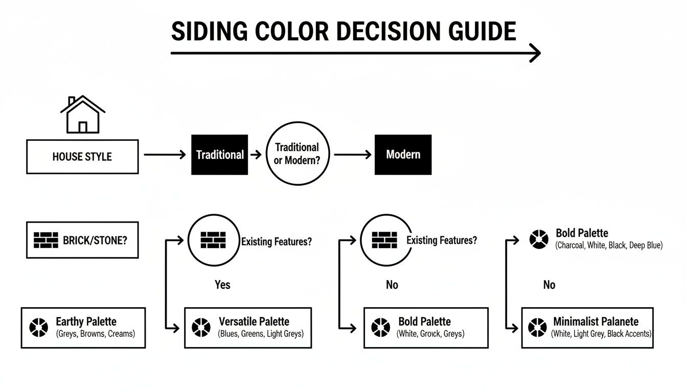
As the guide shows, picking the right color is really a process of elimination. You start broad with your home's style and then zero in based on what’s already there.
Defining Your Look with Trim and Windows
Once you’ve got a siding color that works with your roof, it’s time to think about the trim and windows. These are the finishing touches, the elements that really define your home’s personality. The amount of contrast you choose here can completely change the vibe.
High-Contrast Trim gives you that sharp, classic look. Think about a deep navy or dark gray siding paired with crisp white trim. This approach makes architectural details pop and gives the home a clean, defined silhouette. It's a timeless choice that feels structured and intentional.
Low-Contrast Trim, on the other hand, delivers a more subtle, modern, and unified feel. Pairing a medium gray siding with a slightly lighter gray trim, for instance, creates a sophisticated, cohesive look that’s very popular right now. It's a great strategy for contemporary homes or for anyone who prefers a softer, more understated exterior.
Pro Tip: Don’t forget that your window frames are part of the trim palette! If you have standard white or beige vinyl windows, make sure your trim color complements them instead of clashing. A bright, stark white trim next to a creamy beige window can look like a mistake.
Choosing a siding color is just one piece of the puzzle. For a deeper dive into the general principles of color selection, check out this guide on how to choose paint colors for your home.
And if you want to see these ideas in action, you can browse a wide range of popular vinyl siding colors. By making sure your roof, siding, and trim all work together, you’ll end up with a balanced, professionally designed exterior that you’ll love for years to come.
Why Timeless Neutrals Almost Always Win
It's tempting to go for that bold, trendy color you saw in a magazine. But when it comes to siding, there's a very good reason timeless neutrals consistently top the charts. Off-whites, warm creams, and soft grays aren't just popular—they’re a smart, strategic move for any homeowner thinking about long-term value and appeal.
Think of these colors as the perfect "blank canvas." They let your home's unique architectural details, lush landscaping, and personal touches—like a colorful front door—truly stand out.
A neutral palette creates a clean, inviting look that works with just about any home style, from a classic brick ranch to a modern farmhouse. Lighter shades also come with a powerful bonus: they make your home look bigger. A house dressed in a creamy white or a light, airy gray reflects more sunlight, giving it an expansive feel that instantly boosts curb appeal.
The Numbers Don't Lie
This isn't just a gut feeling; homeowner surveys consistently back up the preference for neutrals. A 2023 Harris Poll of over 1,400 homeowners found that 40% would choose a neutral palette for their home's exterior. Off-white/cream was the number one pick, with light gray and pure white right behind.
Fast forward to 2025, and a follow-up poll showed that trend getting even stronger. Off-white/cream held its top spot, with 42% of homeowners saying they’d go for a “timeless neutral look” if they were choosing today. For anyone concerned with resale value, these numbers are a clear signal: neutrals are the safest, most data-driven bet you can make.
This is especially true when you're working with materials built to last for decades. For example, understanding the pros and cons of fiber cement siding—which is famous for its incredible color retention—makes the case for choosing a timeless neutral even stronger. You'll be living with that color for a long, long time.
Here's a quick look at what homeowners are choosing right now:
Top Neutral Siding Color Preferences (2025 Homeowner Survey)
This table shows the top neutral color choices from a national survey, highlighting their popularity and suitability for maximizing curb appeal.
| Off-White/Cream | 42% | Farmhouse, Colonial, Traditional |
| Light Gray | 28% | Modern, Craftsman, Coastal |
| White | 19% | Cape Cod, Greek Revival, Modern |
| Soft Beige/Taupe | 11% | Ranch, Mediterranean, Traditional |
As you can see, these colors aren't just safe—they're versatile enough to complement a wide range of home designs, making them a reliable choice for curb appeal.
Give it Personality with Smart Accents
Choosing a neutral siding doesn't mean your home has to be boring. Far from it. A neutral backdrop gives you the perfect chance to inject personality with sophisticated accent colors on your shutters, trim, and front door. This is where you can have some real fun without committing your entire home to a color that might feel dated in just a few years.
Pro Tip: Think of your neutral siding as the foundation of your design. It's the stable, timeless element. Your accent colors on shutters, the front door, or gables are where you can experiment—they're much easier and cheaper to update down the road.
We've seen some fantastic combinations here in the Upstate. Consider pairing:
- Light Gray Siding with a Deep Navy Door: This is a classic. It’s elegant and striking, offering a touch of coastal charm that feels both fresh and traditional.
- Creamy Off-White Siding with Forest Green Shutters: This combo creates a warm, earthy feel that connects the home to its surroundings. It's absolutely perfect for the lush landscapes we have in Upstate South Carolina.
- Soft Beige Siding with a Rich Burgundy Trim: A warm and inviting palette that feels sophisticated and grounded, adding depth without ever feeling overwhelming.
By using bolder hues in smaller, targeted areas, you create visual interest and character while keeping the broad, long-lasting appeal of a neutral primary color. It's the best of both worlds—a home that feels uniquely yours but will also catch the eye of a wide range of future buyers.
Considering Your Neighborhood and Natural Surroundings
Even the most stunning siding color can feel… off… if it doesn't fit its surroundings. Your home isn't an island; it's part of a bigger picture that includes your neighbors, the local landscape, and sometimes, local rules. Paying attention to this context is a huge part of learning how to choose siding color that feels right every time you pull into the driveway.
Your home should absolutely reflect your style, but it shouldn't stick out like a sore thumb. The real goal is to pick a color that adds to the street's overall vibe, whether you're in a historic Greenville neighborhood or a newer development out near Greer.
This doesn't mean you have to paint your house beige just because everyone else did. Just take a walk around the block. What's the general feeling? Are most homes painted in warm, earthy colors, or do cooler grays and blues rule the day? Choosing a color that complements the existing palette makes your home feel like a thoughtful, harmonious part of the community.
Blending with the Upstate South Carolina Landscape
Here in the Upstate, we're surrounded by gorgeous, green landscapes for most of the year. That natural backdrop is the perfect inspiration board for your siding. Colors pulled from nature almost always look fantastic because they connect the house to the land it sits on.
Think about colors that work with our local scenery, not against it:
- Sage and Olive Greens: These are a no-brainer. They blend right in with the natural foliage, creating a calm, grounded feel.
- Warm Beiges and Taupes: These shades echo the tones you see in local stone and soil, giving off a warm, inviting vibe.
- Rich, Muted Browns: A deeper brown can anchor a home, especially on a wooded lot, making it feel like an extension of the forest around it.
Local Insight: A bright, tropical teal might look amazing on a beach house, but it can feel jarring against the backdrop of the Blue Ridge foothills. When in doubt, lean into the natural beauty of the Upstate for a timeless look.
Navigating HOA and Community Guidelines
Okay, this part is crucial. Before you get your heart set on that perfect shade of navy blue, you absolutely have to check your neighborhood or HOA (Homeowners Association) rules. Many planned communities have a pre-approved list of siding colors to keep everything looking cohesive.
It’s usually as simple as requesting a copy of the architectural guidelines from your HOA. These documents will spell out any color restrictions or approval steps you need to take. Getting this sorted out upfront will save you from the massive headache—and expense—of having to repaint because your color choice wasn't approved.
At the end of the day, choosing a color that respects its environment is just a smart move. It not only ensures your home looks fantastic but also boosts the visual appeal of the entire neighborhood, which is a great way to improve curb appeal for everyone.
How to Test Siding Colors the Right Way
You’ve narrowed down the choices, and the finish line is in sight. But this next step is arguably the most critical: testing your top contenders in the real world. A tiny paint chip viewed under the harsh fluorescent lights of a hardware store tells you almost nothing about how a color will actually look on your home.
The truth is, color is a chameleon. It changes dramatically based on light, texture, and scale. A soft gray that looks perfect on a small swatch can suddenly appear much lighter—or even reveal unexpected blue undertones—when it covers an entire wall. This is why you must move beyond those little samples.
The Problem with Small Swatches
Small color chips are only useful for getting rid of the "no-way" options. To make a final decision, you need to see the color in its true environment. Even the texture of the siding material itself plays a huge role in how we perceive its color.
- Smooth Finishes: Siding with a smooth surface, like some fiber cement or vinyl options, reflects more light. This can make a color appear slightly lighter and crisper.
- Textured Finishes: A wood-grain texture creates subtle shadows that can make the same color feel a bit darker and richer.
The only way to really know is to order product samples and test them directly on your house. Get the largest samples you can find—at least a 2x2 foot square, if possible—to get an accurate impression.
Pro Tip: Never hold a sample up against your old siding color. The existing color will trick your eye and distort your perception of the new one. Instead, hold it up against a large white poster board to see its true hue without interference.
Your On-Site Testing Checklist
Once you have your large samples, the real observation begins. You need to see how they perform throughout the day as the natural light shifts.
Tape your samples to different sides of your house—one that gets direct morning sun and one that gets afternoon light. A color can look completely different on the north side (cool, indirect light) versus the south side (warm, direct light).
Then, make it a point to check the samples at three key times: in the morning, around midday, and in the late afternoon. Notice how the color shifts as the sun moves across the sky.
And don't just look on a bright, sunny day! See how the colors appear when it's overcast or rainy. This gives you the most complete picture of what you’ll be living with year-round.
This diligence really pays off. Sales data shows that most homeowners ultimately choose timeless light neutrals for a reason. James Hardie, for instance, reports that Arctic White alone accounts for 35–45% of its sales, with grays like Cobble Stone and Iron Gray also seeing major growth. Testing ensures the neutral you pick is the right one for your home's unique lighting and character.
Got Siding Color Questions? We've Got Answers.
Even when you think you’ve landed on the perfect color, a few last-minute questions always seem to pop up. That’s completely normal. Getting these details ironed out is the final step to feeling 100% confident in your choice. Here are the answers to some of the most common questions we hear from homeowners right here in Upstate South Carolina.
Should My Siding Be Lighter or Darker Than My Roof?
This is a classic, and for good reason! As a reliable rule of thumb, your siding should be lighter than your roof.
Think of it this way: a darker roof visually "grounds" the house, giving it a sturdy, anchored look. The lighter siding then gets to be the star of the show. A roof with charcoal gray shingles, for example, pairs beautifully with a light gray, off-white, or even a soft beige siding. It just feels balanced and intentional.
While some ultra-modern designs flip this rule for a dramatic effect, sticking to the "dark roof, lighter body" guideline is a foolproof strategy for timeless curb appeal.
How Many Exterior Colors Should a House Have?
We've found the sweet spot is almost always three. Any more, and things can start to look busy. Any less, and the house might feel a bit flat.
This is where the classic 60-30-10 rule comes in handy. It’s a simple trick designers use to create a perfectly balanced and polished look.
Here’s the breakdown:
- Dominant Color (60%): This is your main event—the siding color.
- Secondary Color (30%): Use this for the trim, fascia, and other architectural details.
- Accent Color (10%): This is your pop of personality, perfect for the front door and maybe the shutters.
A perfect example from a recent project would be a light gray siding (60%), crisp white trim (30%), and a bold navy blue for the front door (10%). Following this three-color palette is a straightforward way to guarantee a cohesive, professional-looking result.
Your siding color is a long-term commitment. Choosing a factory-finished product you love from the start means you can enjoy a vibrant, low-maintenance exterior for decades, sidestepping the future costs and hassle of repainting.
Can I Just Repaint My Siding Later On?
Technically, yes, you can paint both vinyl and fiber cement siding down the road. But—and this is a big but—it’s not as simple as grabbing a brush and a can of paint.
Vinyl siding, for instance, expands and contracts with temperature changes. It needs a special "vinyl-safe" paint formulated to be flexible. Using the wrong kind can lead to peeling, cracking, and even warping.
Fiber cement is a bit more forgiving and holds paint well, much like wood. However, we almost always advise homeowners to pick a factory-finished color they’ll love for the long haul. That baked-on color is engineered to be incredibly durable, resisting fading and chipping for years.
Choosing the right color from the get-go is not only easier but also protects your investment. You can learn more by reading our guide on how long does siding last.
Ready to find the perfect color and transform your home's exterior? The team at Atomic Exteriors has the expertise to guide you through every step, from color selection to professional installation. Contact us today for a free, no-obligation estimate at https://atomicexteriors.com.